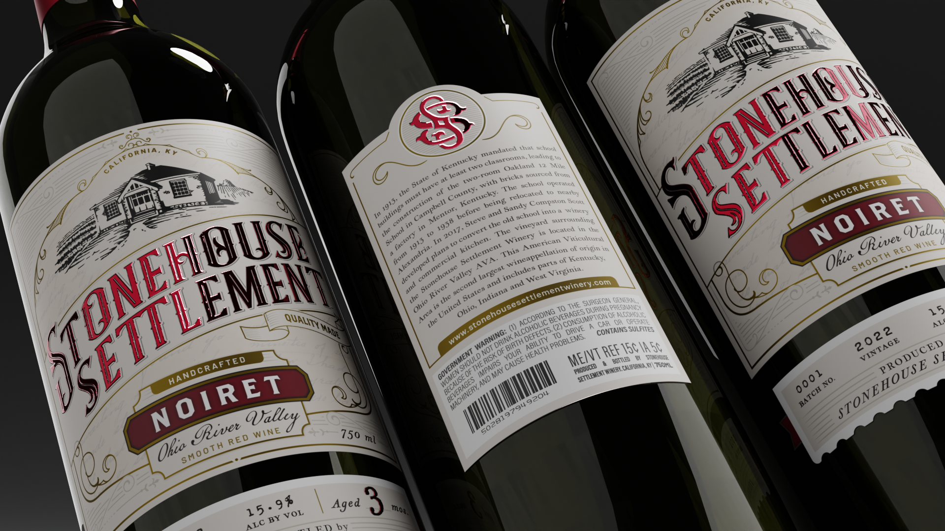
The founders of Stonehouse Settlement needed help bringing their vision and unique story to life, as renovating a mid-19th century school house into a winery was a monumentous task in its own right. Their challenge for me was to create a completely new brand that was as rich, rustic and robust as their small-town wine. I took it upon myself to become ingrained in the history of the building and the lives it touched in order to bring to fruition something genuine, personable, and meaningful.
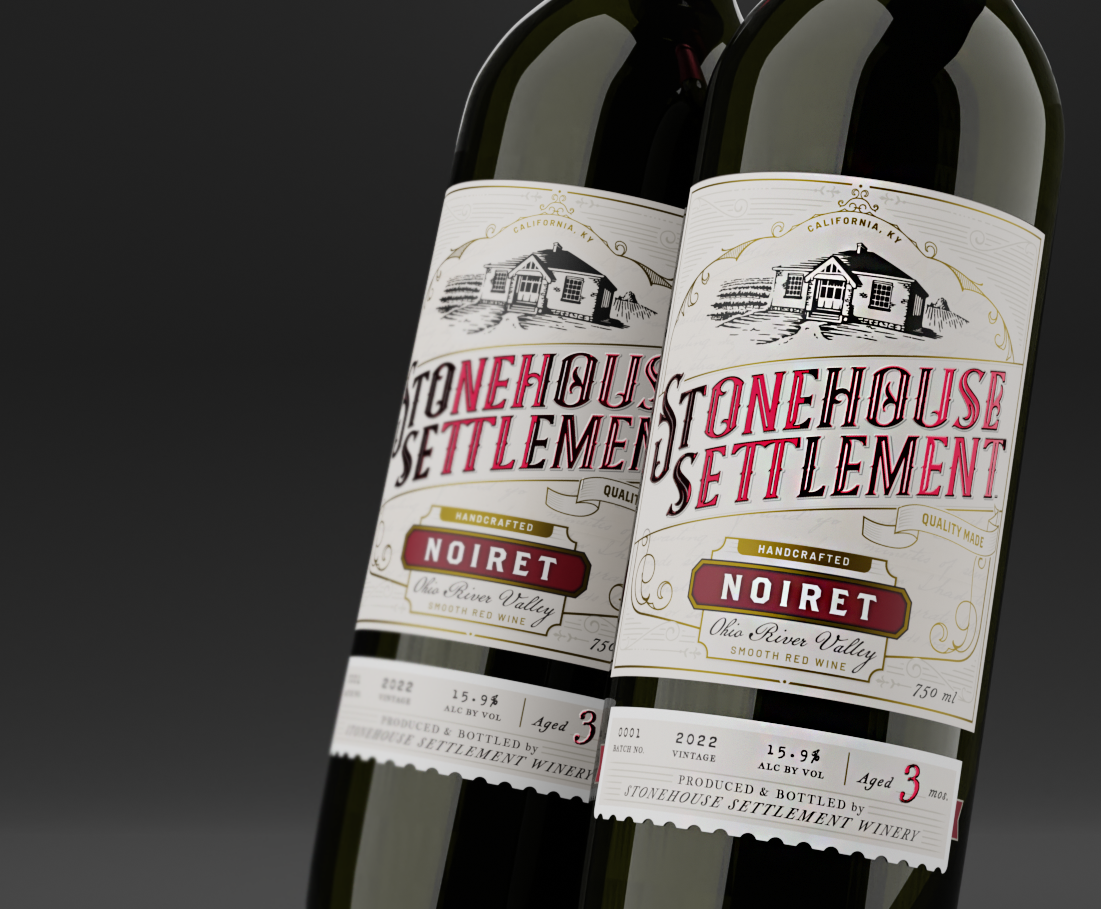
Wine Labels
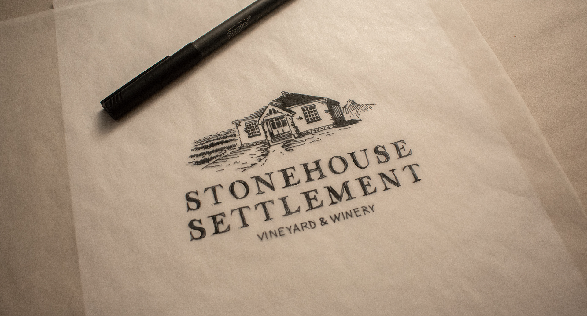
Primary Logo Sketch
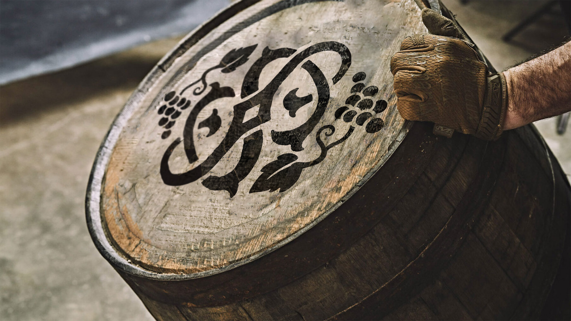
Secondary Logo
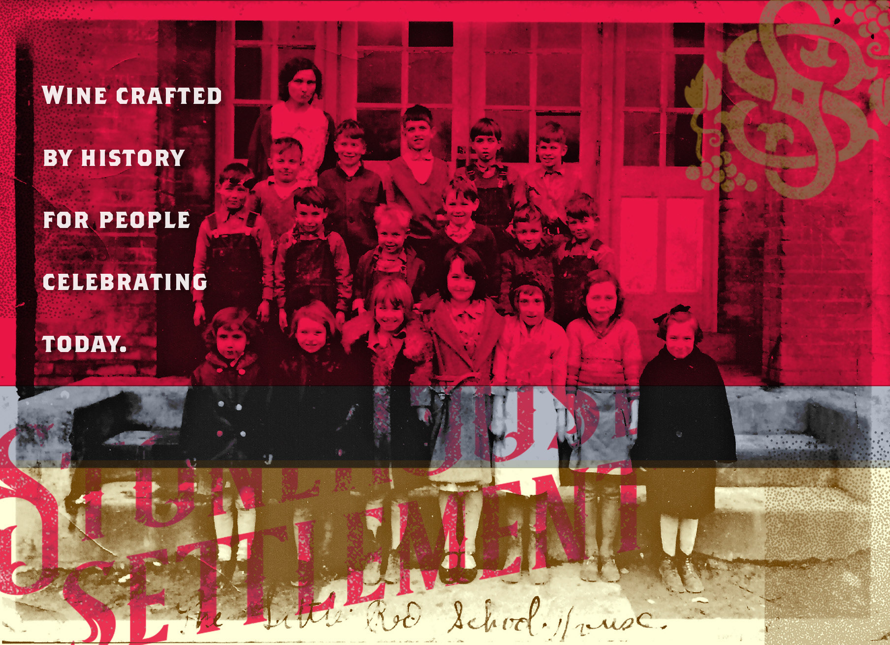
Brand Art
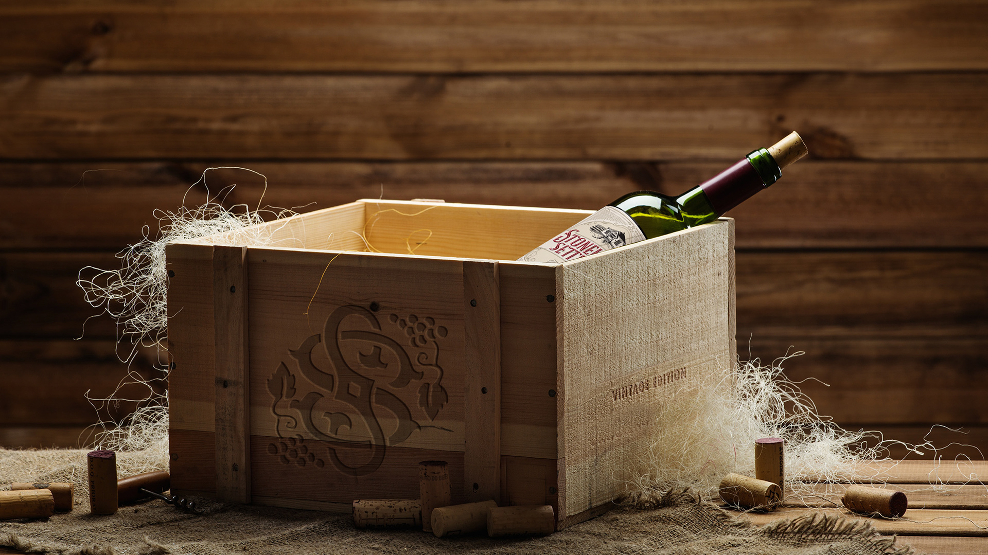
Branded Wine Box
Wine Labels 2

Brand Development
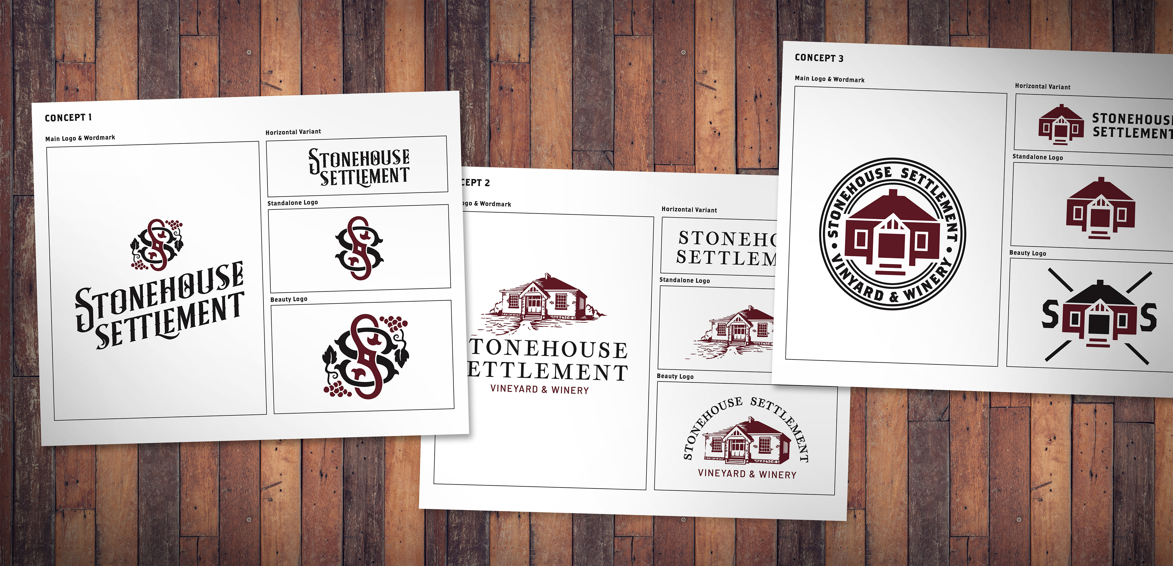
Logo Exploration
PROBLEM
Create a brand, including both digital and print assets, for a new winery that focuses on community and local history. An old red brick school house is to be refurbished on site and will act as the focal landmark of the winery.
SOLUTION
Leaning into the history of the schoolhouse and the time period which it hails from, I immediately went to work on utilizing design elements and practices from the early 1900s. Drawing out and inking the logo by hand was important, as it reflected the handcrafted quality of the wine itself.
For the word mark found on the bottle label, I used a typeface that reflects advertisements of the Prohibition Era, which has an elegance to it that mimics grapevine growth.
Surrounded by the local bourbon scene in Kentucky, I felt the colors and secondary design elements should take inspiration from the many whiskey labels produced in the area. This not only helps the wine bottle stand out on the shelf, but also tips its hat to the history of spirits made in the Commonwealth.