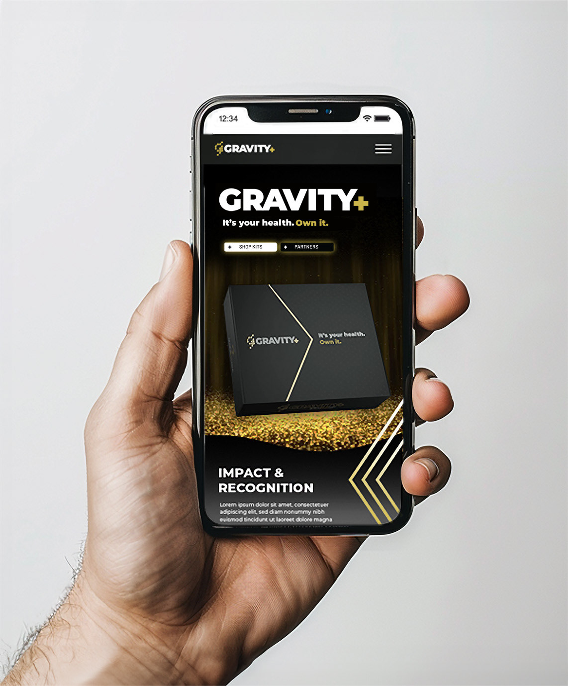
Looking to break into the emerging at-home testing market, Gravity Diagnostics officially opened a new branch of the company called Gravity Plus. This direct to consumer brand would strive to revolutionize personal health with bold, unique branding and messaging.

Take Home Kit Exterior
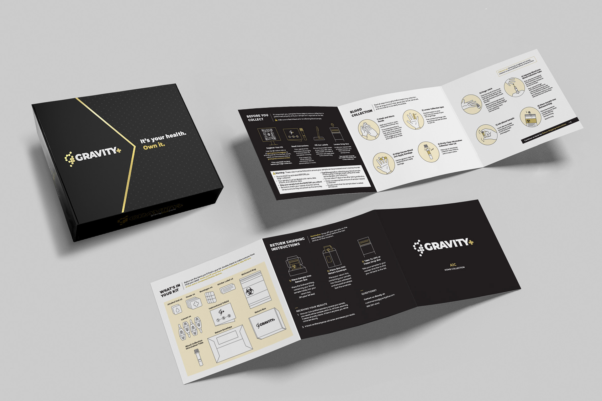
Take Home Kit Instructions
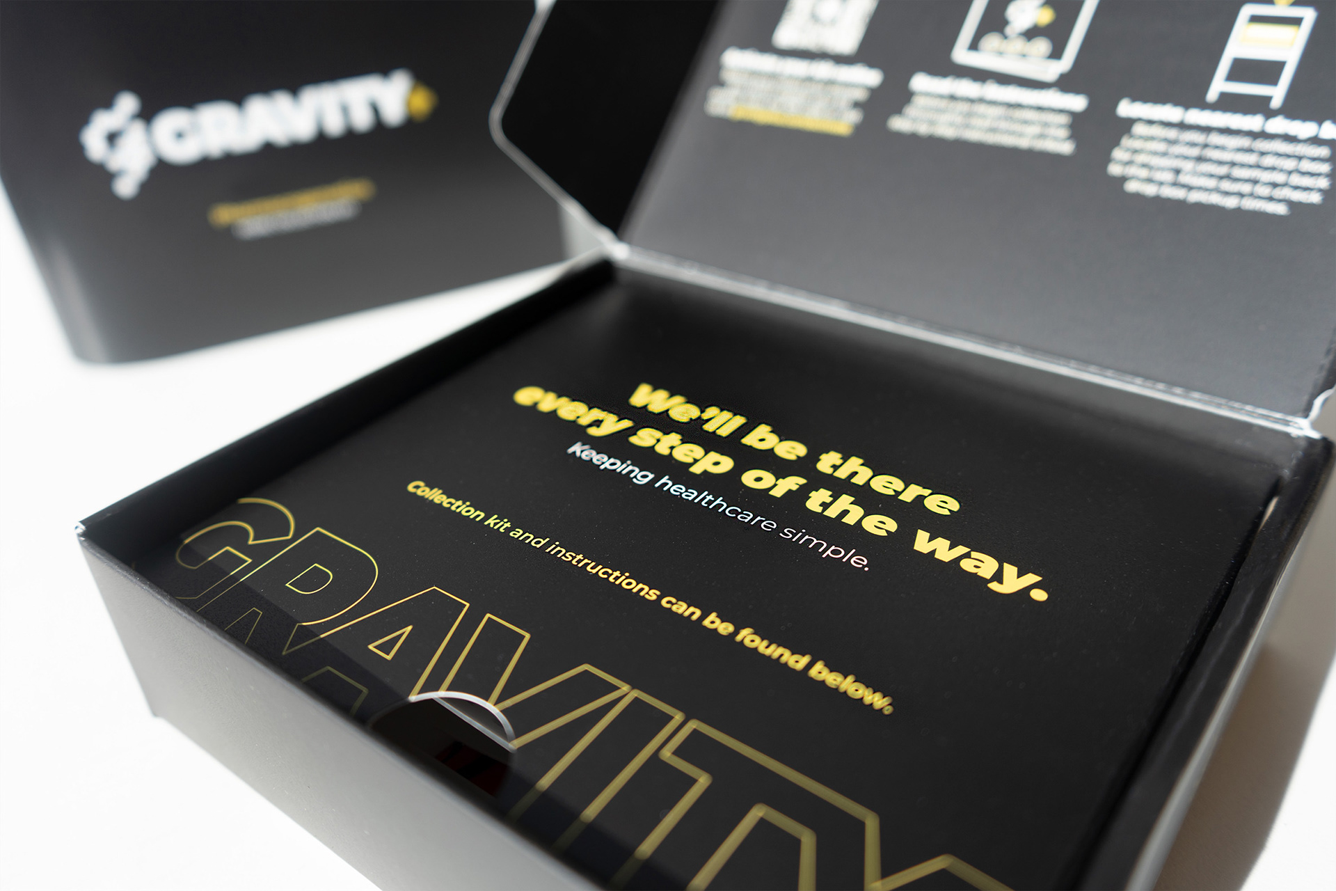
Take Home Kit Interior
PROBLEM
Develop a comprehensive brand package that stands out in the competitive B2C health market while also paying homage to the Gravity Diagnostics name.
SOLUTION
Utilizing Gravity's established logo and initial brand direction, I created a brand guide that reflected a modern and sleek aesthetic. I then developed website and social media visual directions based off of the brand guide to help G+ emerge as an industry leader in an ever-growing competition pool.
To make our take home kits stand out on the shelves, we featured a satin black box with metallic gold accents; a stark divergence from the sterile white used by our competitors. The color choices were used to express Gravity's commitment to luxurious customer experiences and quality products that happen to have affordable prices.
To make our take home kits stand out on the shelves, we featured a satin black box with metallic gold accents; a stark divergence from the sterile white used by our competitors. The color choices were used to express Gravity's commitment to luxurious customer experiences and quality products that happen to have affordable prices.